

Making a Cover

Q: Can you please do a detailed “process post” about making a cover for The New Yorker?
The first step in the process is an intangible, invisible one. It’s basically just me going about the normal, boring activities of my life, and then seeing or hearing or thinking about something that might be the germ of an idea. I’ve talked about this a little bit in relation to writing, but I will go to absurd lengths to avoid sitting down in front of a blank sheet of paper without at least a vague plan of action. I know some people are energized by that experience, but to me it’s intimidating, miserable, and rarely productive.
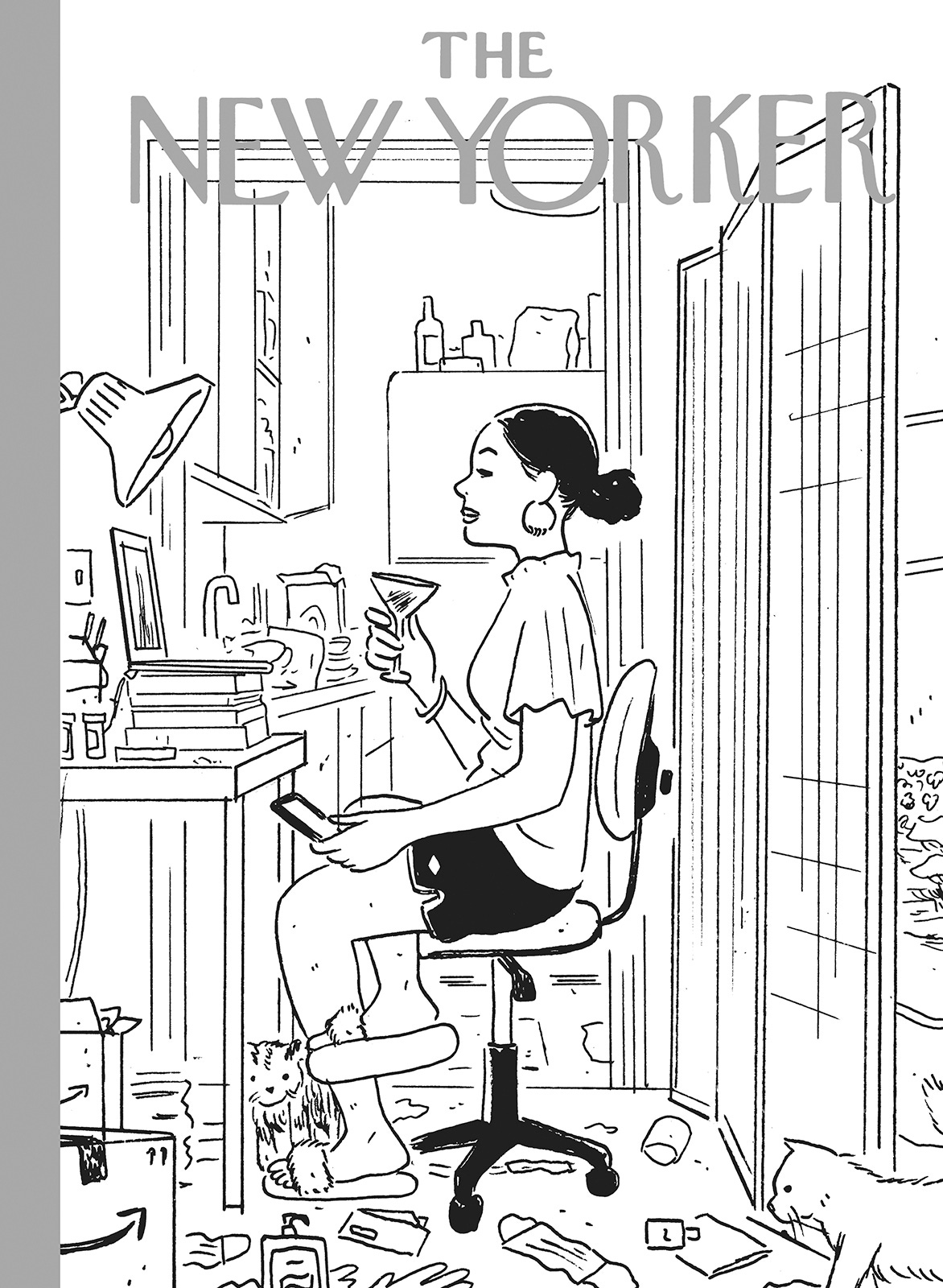
So in this case, I didn’t have to look too far for the initial idea. In the fall of 2020, most of us were living some version of this dual life where our onscreen presentation was much more carefully groomed and curated and well-lit than the chaos that existed just outside the frame. But that’s all I started with: a broad, situational concept that I would need to condense into a single image. Of course, the focus would have to be on someone using a computer, and early possibilities included a kid attending online school, a family connecting with distant loved ones, and a psychologist steadfastly working with a patient. Somehow I finally settled on a young, single person on a Zoom date. Not only did it seem like a premise that I could communicate simply and clearly, I had the sense that it might allow a tiny glimmer of much-needed levity and even—dare I say it?—uplift.
This first sketch was drawn fairly small, about 6” x 8”, with a Pitt Artist Pen and a Pentel Pocket Brush. The basic composition and most of the significant details are there already, but the perspective and proportions are clearly way off.
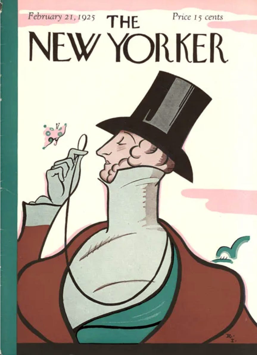
It wasn’t a conscious choice, but the vague echo of Eustace Tilley, the character depicted by Rea Irvin on the very first cover of The New Yorker, was immediately apparent to me. I didn’t feel like I needed to draw attention to it, but I also didn’t feel the need to eradicate it. The history of the magazine is something I’ve thought a lot about, and it seemed appropriate to leave that subconscious allusion intact.
I submitted the sketch, via email, to The New Yorker’s arts editor Françoise Mouly and the associate covers editor Genevieve Bormes. Françoise let me know that she liked it, but asked if I could revise the sketch to clarify the image’s focus, perhaps with color or lighting. As usual, her note was on point, and a simple alteration (an addition, really) improved the image immensely.

I added a grey tone (and the highlights) very quickly in Photoshop, with just enough care to roughly indicate the shadows and light sources. A black and white image was sufficient here, as The New Yorker has, amazingly, always been very trusting with regards to my coloring, and I’ve never received a note about it.
At this point, the image was approved by both Françoise and editor David Remnick, and I moved on to creating the final image.
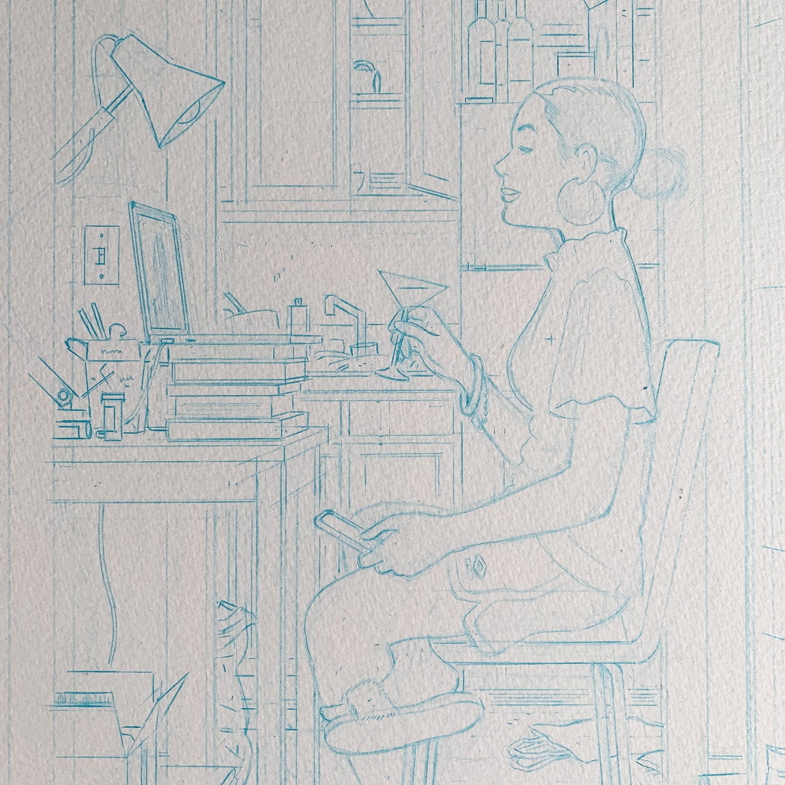
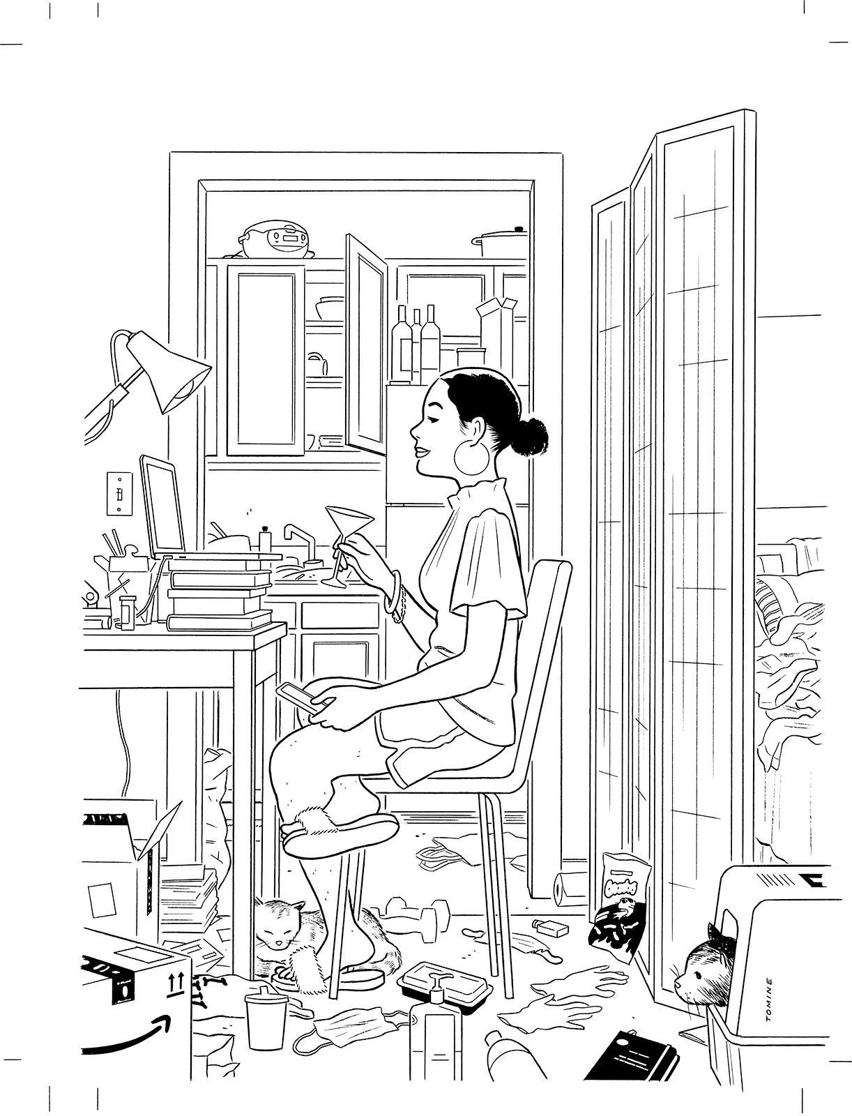
I drew this much larger than the sketch, which allowed a greater level of detail. I used a 13” x 16” sheet of Canson Montval watercolor paper, and I drew the image with Uni 0.5 mm mint blue Nano Dia lead in a Muji Low Center Gravity mechanical pencil.
For this version, I worked out the perspective properly (rather than just eyeballing it, as I did in the sketch). I picked a vanishing point, which you can see in the form of a small “x” on the woman’s shirt, and used that as an anchor for all the lines that seem to extend out of the image towards the viewer. That’s probably a confusing, clumsy way of describing this aspect of perspective. I’m sorry…just look up “perspective” or “vanishing point” and someone smarter than me can explain it!
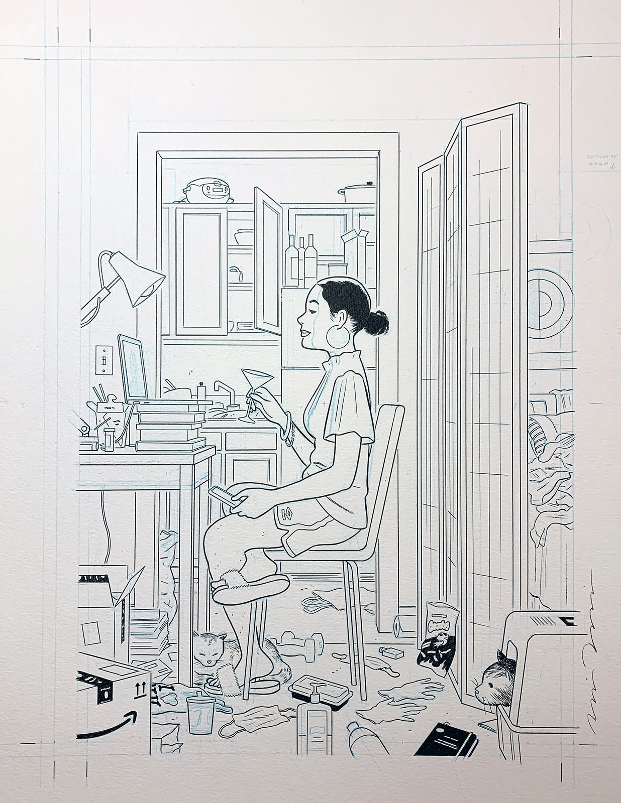
In the penciling stage, I also added and refined a lot of the details. I improved the kitchen layout, and generally made all the clutter more specific and accurate. I added a Zojirushi rice cooker, a litter box, some hand weights, a bag of Flaming Hot Cheetos, and a certain graphic novel that had recently been published. For most of these items, I didn’t need to look beyond my immediate surroundings for reference.
I knew I wanted some kind of artwork above the bed, and I settled on a Hilma af Klint print. In my memory, the retrospective of her work at the Guggenheim was one of the last big, citywide cultural phenomenons before everything shut down, and I imagined a whole backstory about the character in my illustration attending that show with friends, purchasing the poster, and suddenly viewing it as a souvenir from a bygone era. Similarly, I decided to add to the clutter by including a discarded plastic bag (which the Chinese take-out on the table had been delivered in). Milton Glaser had recently passed away, and the ubiquitous, iconic “I ♥ NY” logo on the bag was a tiny nod to his passing and his legacy. I know, it’s totally insane to think about throwaway details to this degree, but I can’t help but approach an illustration like this with the mind of a cartoonist, and suddenly there’s a reason or a story for everything.
Once the pencil drawing was complete, I moved on to the ink phase.
I used a Winsor & Newton series 7 (size 3) brush for anything that looks soft, fuzzy, or squishy (e.g. clothing, cats, hair, pillows, masks). The sharper, more uniform lines were drawn with either a Pitt Artist Pen or a Tachikawa “school” nib. Touch-ups and alterations (like the bottom edge of the tabletop) were made with a Muji correction pen.
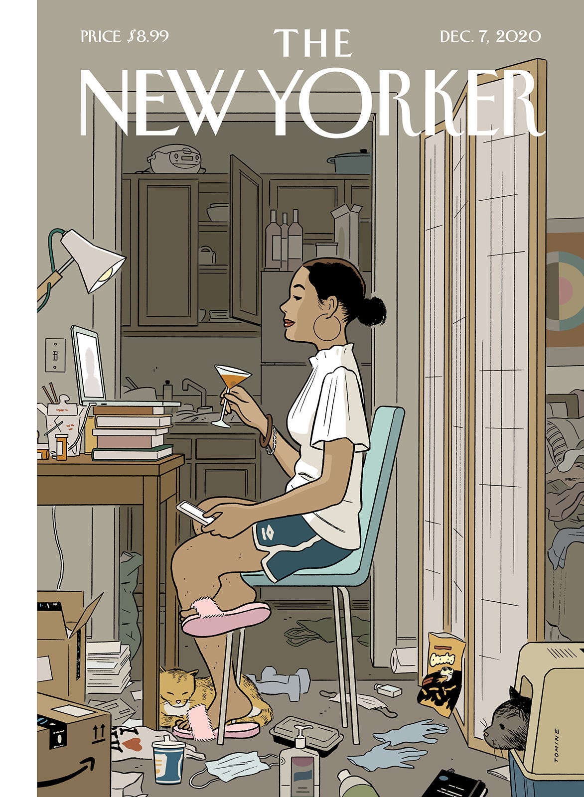
Once the inking was complete, I scanned the image into the computer, creating a 1200 dpi bitmap file.
I scaled the image down to print size (7 ⅞” x 10 ¾”) and made a few minor touch-ups and corrections in Photoshop.
Then I imported that image into Illustrator and created all the color. This was the step that really had me tearing my hair out. It’s hard enough for me to arrive at a color scheme that just looks nice, but I was juggling a few other objectives with this one. I wanted to portray a darkened room, lit only by the lamp and the computer and phone screens (per Françoise’s note), and I also wanted a sense of depth. There were a bunch of details that dictated their own palettes (like the Purell bottle, the paper coffee cup, the poster, etc.), and I wanted to be as accurate as possible. And most of all, I wanted all the colors to somehow look eye-catching and pleasant, with the right balance of harmony and contrast. In the end, it was a matter of compromising on all those fronts, and eventually arriving at the best version of “good enough.”
The final image, including the logo and the “strap” (the band of color on the left edge) was assembled in InDesign. And that’s it. I saved the whole image as a PDF and emailed it to Françoise and Genevieve.
One thing that still astonishes me about working for The New Yorker is that I can turn in an illustration on Thursday, and by Monday, it’s everywhere: on newsstands, online, in people’s hands on the subway, and even, in this case, on daytime tv.
There’s no other venue for my work that gets a quicker or bigger response (or impresses my Brooklyn-born in-laws more), and for that week or so after a cover is published, I kind of feel like a big deal. And then I go back to being a cartoonist.
I’m gawking at all the details, from the technique to even the thoughts behind showing the I ❤️ NY logo (and the unshaven legs 🙃). Suddenly a thought came into my head—why bother trying? Thankfully, I took hold of that stinky thought and threw it into the bin. Practice, keep going, keep growing. Thanks for sharing this inspiring behind-the-scenes process, Adrian. 💪🏻
Hey Adrian, just to add to the explanation (and maybe to the tools post). How do you scan such a large piece of work? Do you have a large format scanner at home? (If so, which?) or you take it to a place to have it scanned? This has been a problem for me, its hard to find an accesible scanner-printer with a scan area larger than A4, specialized large format scanners are extremely expensive and print shops usually give a terrible result on their regular Xerox copy machines.
I love your work, It's been such a huge inspiration for me and my career and this newsletter has extremely useful to learn. Thanks and keep up the good work. Greetings from Mexico.